Transit speed can be one of the most critical factors in determining a rider’s public transit experience.
Riding in a bus traveling at walking speed is a major frustration that can be all too common, but flying past private vehicle traffic in a bus-only lane can make a passenger feel like the king or queen of their commute.
With a surge of federal infrastructure funding and new technology, planners today have a unique opportunity to improve transit speeds and, as a result, the overall usefulness of the transit systems. In this post, we’ll talk about how planners can use accurate speed data to introduce a performance improvement cycle to make the most efficient and impactful investments in their systems.
Speed and Its Impact on Transit Outcomes
Ridership has long been the top line metric for public transit agencies. But lately, chasing pre-pandemic ridership has felt like a misleading barometer to quantify public transit’s value.
In the public transit industry, we all recognize that we’re providing communities with an essential service: equitable, reliable, and clean transportation. In my previous role as a planner with the Chicago Transit Authority, I saw firsthand the vitality and economic opportunity that transit can bring to a city. Through the pandemic, travel patterns have changed in communities across the country, and the public transit industry needs to find new metrics to measure our value beyond just ridership.
Instead of just counting the number of riders, we can measure how transit systems improve access to opportunity. Over the past several years, the focus in the industry has begun shifting from how many people are utilizing the service? to what can riders use the public transit system to do? In an earlier post on this blog, we had a conversation on different ways agencies can quantify this impact, from the number of jobs accessible through the system to access to other destinations such as museums and sporting events.
Of course, one of the key factors in expanding access to opportunities with transit is the actual speed of a transit service. Faster travel times naturally allow riders to reach more destinations in a set amount of time, broadening the number of job opportunities or amenities that become accessible. Faster speeds can also reduce the resources required to provide the same level of service, leading to situations where agencies can reinvest savings into more frequent or expanded service.
Arriving full circle, rising speed lifts all boats. According to one UK agency’s analysis, a 10 percent increase in average speed systemwide equated to roughly a 10 percent increase in ridership. Even as we seek out alternative metrics to measure the impact of transit, we can recognize the importance of attracting new riders. Faster speeds can fuel performance improvements that bring new riders to the system, sparking an upward swell instead of the dreaded downward spiral.
Speed Data and the Performance Improvement Cycle
Transit planners are uniquely positioned to move the needle on transit outcomes through their contributions to improving bus speeds. Of course, you can’t improve what you can’t measure, and for projects aimed at improving transit speeds, that means evaluating historical speed data. These types of analyses allow planners to identify problem areas, target investments where they’re needed most, and ensure implemented projects are meeting goals. Accurate, actionable insights about bus speeds can fuel this performance feedback cycle and pave the way for future projects.
PLAN > BUILD
Recent federal infrastructure funding offers a generational opportunity to plan and build new bus priority projects, and transit planners are often responsible for selling their solutions to stakeholders within their agencies, local government, and their broader communities. Without compelling data, it can be difficult to secure buy-in for projects that would improve transit speeds, whether a major BRT corridor or more modest, targeted improvement at the most congested intersections. Looking at detailed speed data allows planners to identify the most impactful locations for improvements and empowers them to move beyond anecdotes and towards fact-based analyses in their conversations with traffic engineers, elected officials, and the public.
EVALUATE > IMPROVE > CELEBRATE (THEN RINSE AND REPEAT)
Once a project has been implemented, speed data becomes just as critical to evaluate its impacts on performance. Without accurate, easy-to-access speed data, planners are unable to identify areas that may need further attention. Most importantly, they won’t be able to celebrate any wins with external stakeholders.
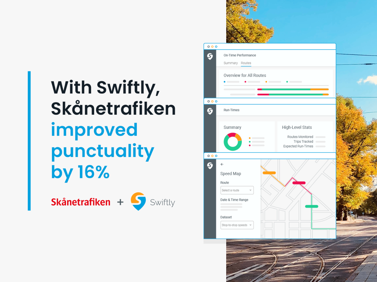
In one example of this process in action, I recently worked with a large transit agency to evaluate the effectiveness of a recent transit signal priority (TSP) project along a major bus corridor. Their staff used Swiftly’s Speed Map product to look at speed variability at TSP intersections and ultimately found an overall improvement, but up to 12 hours of latent daily delay. Using Swiftly’s Speed Map data, planners then identified the worst performing TSP intersections to prioritize further analysis and targeted tweaks to the TSP settings and other transit-priority infrastructure at these intersections. Through this process, they are now able to focus their scarce time and resources on the most problematic intersections, potentially leading to further running time savings and opening up the option to increase service with their current resources. This type of analysis will continue to provide this team value as traffic patterns shift and subsequent transit-priority projects are planned and implemented.
Speaking the Language of Traffic Engineers with New Data Points
Historically, planners have faced obstacles to conducting comprehensive speed analysis.
For one, planners haven’t always had access to accurate and easy to use data. Speed data from legacy tools may need to be synthesized from raw data or manipulated manually in spreadsheets. This forces planners to become data scientists and makes it difficult or too time-intensive to do even the simplest analyses.
Second, there is a dearth of guidance for transit planners on how to use speed data. Much of the existing research and best practices for speed analyses are based on traffic engineering principles for roadway performance and private auto throughput.
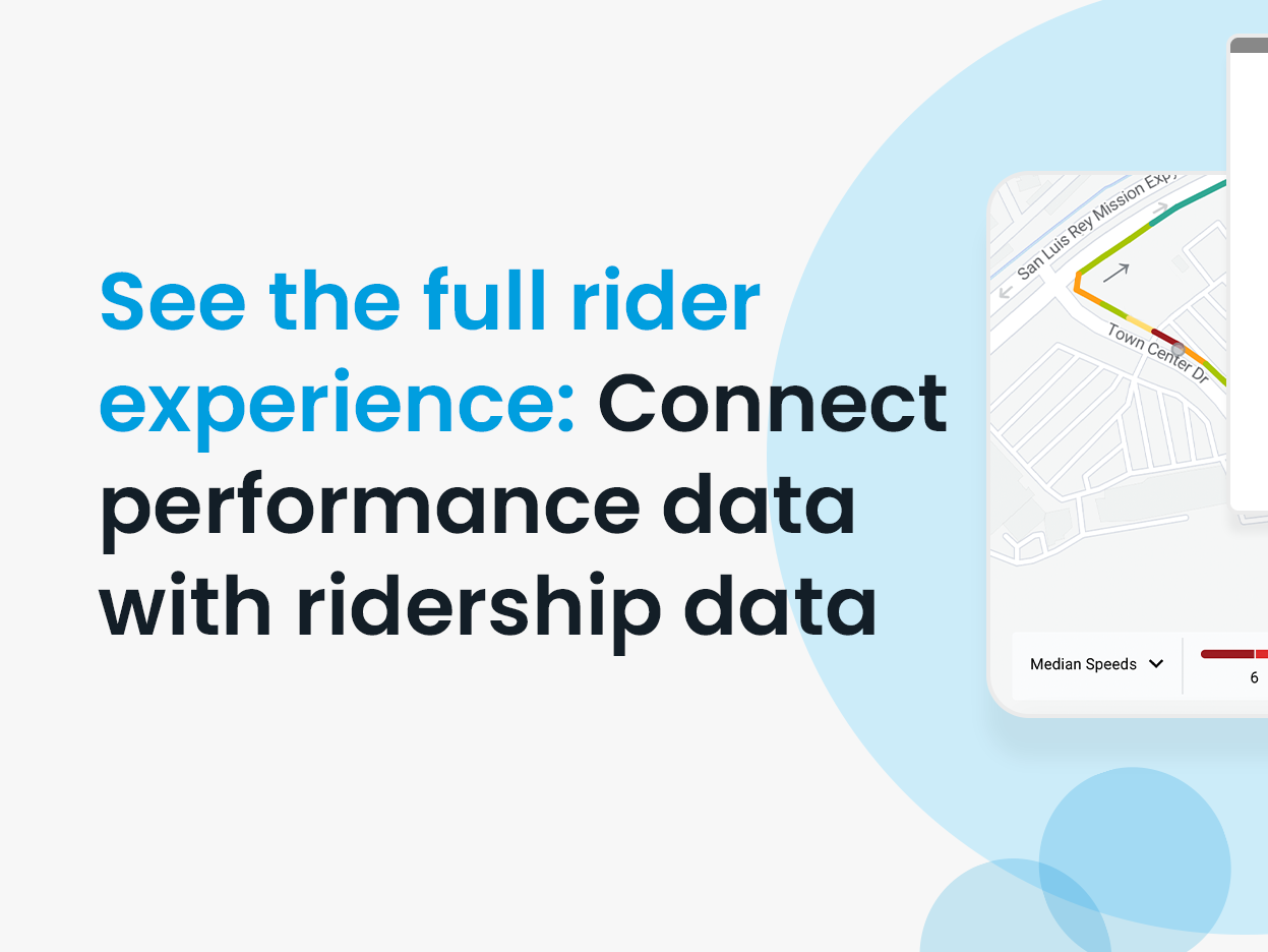
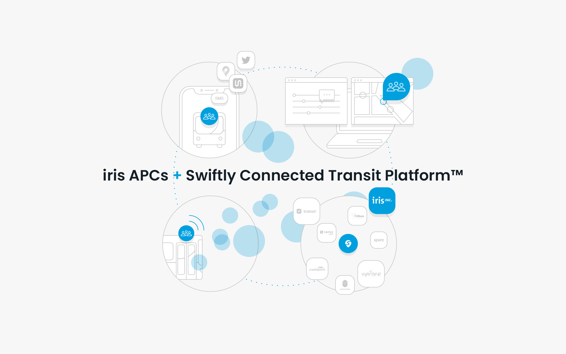
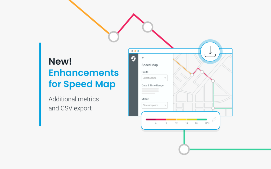
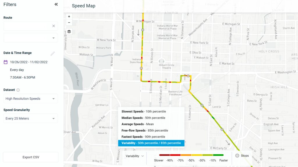
Swiftly is addressing both of these challenges with new capabilities for Speed Map.
New metrics within Speed Map allow planners to evaluate the distribution of speeds in a given period with visualizations of the slowest speed (10th percentile), fastest speed (90th percentile), free-flow speed (85th percentile), and variability (ratio of median speed to the 85th percentile speed). These metrics help planners get a more robust window into the rider experience that goes beyond just a simple average.
Let’s take a few examples:
- Wild cards: Intersections or route segments with high variability suggest there are conditions that slow down buses at certain times of the day. Identifying these areas can allow transit planners to search for solutions that can alleviate those problem times, such as rush hour bus-only lanes.
- When it’s slow, it’s sloooow: It’s tempting to write off a slow tenth percentile speed as an outlier with only a minimal impact for riders. But passengers who ride a route to work may experience that speed once a week. On a segment with a tenth percentile speed of five miles-per-hour, a rider would regularly see pedestrians moving at the same speed as their bus. Being able to clearly highlight these areas in the planning process can help sway public opinion and bring facts to often contentious debates on how to manage the public right-of-way.
- All slow, all the time: Areas with very low variability and a slow median average speed mean there’s never relief for riders on this route. If buses never move quickly through a segment, planners may need to look for infrastructure solutions such as transit signal priority (TSP) or adjust schedules.
All of these examples have real impacts on the passenger experience that may not be evident from looking at overall average speed. Previously, these analyses would take hours of work in spreadsheets or other tools with less intuitive data visualization. The new metrics in Speed Map will allow planners to incorporate best practices into their work in just a few clicks, enabling more rigorous evaluation to improve transit outcomes.
Making Data Accessible with CSV Exports
The true impact of speed data can sometimes be measured when it’s placed alongside other datasets. Many transit data tools can make accessing data difficult, time consuming, or even impossible. Swiftly offers unlimited licenses and logins from anywhere with an internet connection, and now Speed Map users can easily download data through a CSV export.
CSV exports will include all relevant route, time, and location data as well as several additional speed metrics, allowing agency staff to analyze speed data in Excel, PowerBI, GIS tools, and traffic modeling tools. For example, planners can combine speed and ridership data to understand how many people are impacted by a slow bus at a specific intersection. Further analysis can include multiplying lost time in congestion by the number of passengers and an average value of time to summarize lost productivity due to slow buses. This type of analysis can be incredibly powerful when making the case for transit-priority improvements to external stakeholders.
Transit systems are vital to their communities, and we have the data to show it. As transit planners, we need to put this data front and center when we advocate for community buy-in for our proposed solutions. Similarly, we need to tout the tangible improvements from completed projects before we go back to the well for future support.
These new data sources are designed to help transit planners overcome the barriers to effective speed analysis and speak the language of traffic engineers, helping to advocate for, plan, build, and evaluate the most successful projects possible.
This article was originally published by Swiftly.